
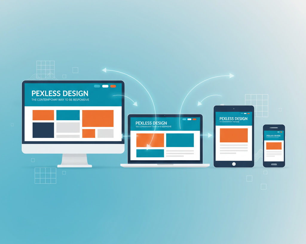
Have you ever gone to a website just like that one on your computer that you liked the layout of, and then you looked it up on your phone, and all you saw was a jumbled mess? The font was so small you couldn’t read it, the buttons were too small to even understand, and the images were all cut off. This condition is usually because the design has relied on too many fixed pixel values in the design implementation.
In this article, we will examine pixel-less design, a modern principle that focuses on flexibility and adaptivity. We will explore what “pxless” means, why this is important in our multi-device reality, and how you can adopt the traditional principles of boxless design to develop flexible, future-proof websites in the development process. Get comfortable developing designs that adjust instead of being restricted to rigid layouts.
What is Pxless Design?
Pixel-less design is a web design methodology that does not use the fixed pixel (px) units for layout and sizing. Instead, it discusses the implementation of relative units that allow elements on the web page to fluidly resize according to the users’ screen sizes or device capabilities. T The context of this design practice is about creating a design that works universally or is a best fit for desktops, tablets, and smartphones.
“Pxless” is a compound word formed by combining “px” (which is derived from the word “pixels”) and the term “less.” Pixels are small square dots that make up the image of a screen. For example, if a designer declares an element to be “300px wide,” that element will, in fact, be exactly “300px wide” on any screen. The penalty for a fixed-width element is that it can make the design feel broken and not as aesthetically pleasing to the average screen size of a different size or resolution. The “less” signifies our move away from this reliance and towards more dynamic, more responsive structures.
To summarize, pixel-less design doesn’t mean we are eliminating pixels altogether, but minimizing their use in the layout structure. There is still a rationale for their use in some instances with fine-grain control over things like borders and shadows, but the primary layout will be focused on flexibility like containers, grids, typography, etc.
Why Pexless Design Matters More Than Ever
The digital environment has changed greatly. Ten years ago, digital design meant designing for a single desktop screen. Today, users access the web from millions of different devices! This makes responsive design a non-negotiable standard. Pixel-less principles are the driving force behind effective responsive design.
The Problem with Pixel-Perfect Design
The concept of “pixel perfect” design, in which the completed website will look exactly like a static mockup, is already becoming less focused on the “perfect” part. Designing to the pixel does not consider the fluid nature of the web. Here are some reasons that a pixel-dependent approach is a problem:
- Diversity of Devices: There are small smartwatches to ultra-wide monitors available today in many sizes. You cannot make a fixed layout in pixels that will render correctly across this entire array of viscosities.
- High-DPI Displays: Displays like Apple’s Retina displays have even more pixels in the same physical space. Properly sized images and page elements sized in px will look fuzzy or pixelated for high-resolution displays.
- Accessibility:Users zoom or increase their browser’s default font size for readability. Designs based on relative units will shift to the screen size available to them, while layouts that are fixed pixel sizes will break as text overflows elements or overlaps.
The Benefits of a Flexible Approach
There are many benefits to using pixel-less design principles for both development and users.
- Future-Proofing: When using relative units, you’re future-proofing your design against devices you have yet to see or consider. You are establishing an adaptive structure; therefore, when the next ‘big thing’ comes out, you won’t have to think about completely redesigning your responsive structure.
- Improved User Experience (UX): Having a consistent look and feel on your website from visit to visit, across devices, will build trust with the user and provide for a more positive experience using the site. A responsive design (not pixel-based) will keep the navigation paths simple, maintain the readability of the written content, and keep all content properly organized regardless of screen size.
- Easier to Maintain: It is much easier to maintain a single responsive design website than separate sites for mobile, tablet, and desktop. This will help you conserve time and grant you a little more mental peace of mind. A simplified approach saves time and reduces potential errors too.
How to Implement Pexless Design: A Practical Guide
A boxless approach to design means you will be using modern CSS functionality and relative units. Key points are given below:
Learn Relative Units
The basis of boxless design relies on relative units, aspects that are related to something else instead of being a static size.
- Percent: This indicates the size of an element relative to its parent. Percent is useful for fluid grid columns.
- em and rem: These are typographic units. 1em is equal to that of the parent, and this can lead to compounding effects. 1rem is equal to that of the root element () and is more predictable and therefore more widely used. When using rem for typography and spacing, if the user increases the browser’s base size, the entire user interface scales proportionally. The REM unit is a more scalable option.
- VW and VH (Viewport Units): These units are based on the size of the browser window.
1vw = 1% of the window’s width
1vh = 1% of the window’s height
They’re useful for making sections that fill the whole screen or text that resizes as the window changes. Example—font-size: 5vw; that text will scale upwards as the screen scales to become wider, and it will scale down as the width of the screen scales narrower.
- ch and ex: These are less common but still have merit.1ch is equal to the width of the “0” character of the current font, which is helpful in line lengths to create optimal legibility (e.g., max-width: 65ch).
Harness the Power of Modern CSS Layouts
- Flexbox: CSS has progressed beyond uncomplicated floats, and we currently have Flexbox and CSS Grid, both of which are immediate layout models developed just for the purpose of building challenging responsive layouts.
- Works in one direction at a time (row or column).
- Best for aligning and spacing items in a line.
- Great for tasks like centering content, equal column heights, or reordering elements.
- Flexible and simple to use for smaller layouts.
- Grid
- Works in two directions (rows and columns).
- It is ideal for creating full-page or section layouts.
- It allows you to define both the width and height simultaneously, similar to a table but with greater capabilities.
- Ideal for complex, structured designs. Flexbox is also best for managing component-based layouts like navigation, card grouping, or form controls.
- CSS Grid: This two-dimensional layout model gives you control over the rows and columns of a grid layout simultaneously. Grid is the most sophisticated CSS layout tool for creating complex responsive layouts at the page level. The grid has precise placement for items and uses the fr (fractional unit for distributing free space).
Use Intrinsic Sizing and Clamping
New CSS functions let you set sizing rules that give the browser relatively more freedom over the layout, called intrinsic design.
- max(): Think of it as “it won’t be less than this.” An example of this would be width: max(50%, 300px); → The element cannot be less than 300px, and for larger screens, it could expand to 50%.
- min(): It is like “no larger than this.”
- You may, for instance, type min(100%, 800px). This will allow the element to fill up the space available, but not beyond 800px, when it is wider.
- clamp(): It might be discussed that this is the most flexible option; it conceptualizes three values: a minimum value, an ideal value, and a maximum value. The text will resize with the screen, but it won’t go smaller than 1rem or larger than 1.5rem. This provides you a way to provide fluid typography all in one line of code essentially instead of setting up very complex media queries.
Fine-Tune with Media Queries
Though boxless design helps reduce some reliance on media queries, they are still a key aspect to keep in mind. This does not mean that you need to use media queries to make entirely different layouts for different devices. Instead, think of them in terms of surface-level tweaks at specific breakpoints. Perhaps you’d use a media query to achieve the following:
- Switch a multi-column grid to a single column on narrower screens,
- Make tap targets larger on touch devices, and
- Hide non-essential items to declutter mobile views.
It’s also common to adopt a mobile-first methodology, designing base styles for smaller screens using media queries with min-width to then build on their complexity as screen size increases.
Pixless Design in Action: Real-World Examples
Let’s explore how these principles work in the context of common web components.
An Example: A Responsive Card Component
Instead of a fixed width card component with some stylings like:
/* Pixel-based example */
.card {
width: 300px;
padding: 16px; /* Preset value */
font-size: 16px; /* Absolute values, fixed with pixel */
}
you could establish one which is flexible and box-less like:
/* Pxless example*/
.card {
width: clamp(280px, 100%, 400px);
padding: 1rem; /* Will scale with root font size, and a bit of adjustment based on parent(s)*/
font-size: clamp(0.9rem, 2vw,1.1rem);
}
So now the card can resize easily based on content with variable typography, padding values and don’t need to add media queries for each resize adjustment.
Fluid Typography
To maintain an appropriately sized heading on different sized devices, you should apply clamp():
h1 {
font-size: clamp(2rem, 5vw + 1rem, 4rem);
}
Using this one line, the heading will respond to the viewport width by growing and shrinking while never being smaller than 2rem or larger than 4rem.
Scalable Images
To avoid images from overflowing their containers, you always want to use this simple rule:
img {
max-width: 100%;
height: auto;
}
This will make sure an image is never wider than its parent container and it will scale down proportionately.
Conclusion: Embrace Flexibility for a Better Web
Pixel-less design is not simply a group of coding strategies.It’s a thinking shift. The idea is to let the browser decide on layouts and render the best type of layout for the context you are using your browser in. It is letting go of complete control of the layout and leaving your pixel-perfect aspirations behind to use relative units, modern CSS layouts, and intrinsic sizing to create a website that is beautiful, resilient, accessible, and future proof.
For developers and designers who want to create the best possible digital experience, it is no longer optional for you to feel comfortable with complex principles. Start a project with relative units instead of pixels, experiment with clamp(), and use the power of flexbox and grid, and give your users (and future self) a high five for it.